
What's New in our Style Guide
- Aug 17, 2021
- 2 min read

We recently introduced you to our new color palette (click here if you missed it), and we appreciate all of the positive feedback! So we now want to point out a few new design elements you’ll be seeing in our new brand.

More Squares
We’ve been rocking the square logo since day one. So we decided to make that shape a more prominent design element in our brand. You’ll see the square being used in a variety of ways for framing text and images.

Large Chunky Text
We’ve noticed that massive, bold titles seems to be trending these days, and we’re here for it! You’ll see this type treatment in a lot of our headlines and titles.
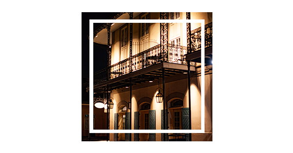
2nd Story Photos
Its been a subtle feature on our website for a while now, but we’re really making a point to show off our camera skills with photos of two-story buildings. Just a fun little reminder of where we got our start.

Open Sans
We’ve switched to a more common and easy-to-read font across the board. Open Sans is now being used for our titles and paragraph copy.

100% Black
You may have noticed that, until recently, we used a softer, dark grey for most of our text and design elements. We’ve switched to using 100% black for a more bold and impactful palette.

Gradients
We feel that our new color palette allows for some nice gradients to be used throughout our brand. So you’ll be seeing less solids and subtle color transitions.
So what do you think? Tell us your thoughts on our recent changes. We are always excited to hear feedback. And if you’re feeling the need to make some changes to your business brand, contact us and let’s take your brand to the next level!


Comments